


In April 2023, the ClimateWorks Global Intelligence team published Achieving global climate goals by 2050: Pathways to a 1.5° C future — a climate modeling report that outlines the transformations needed to meet the ambitions of the Paris Agreement. To develop the scenarios in the report, ClimateWorks partnered with the Pacific Northwest National Laboratory (PNNL) in using their open-source model, the Global Change Analysis Model (GCAM).
For the first time, ClimateWorks has made the report’s datasets freely available for download as a resource for the climate research community. As a result, readers can use the tools developed in partnership with PNNL to track the distribution of global emissions by source, sector, and end-use. By interacting more closely with the data, funders, and other users can consider the broader pathway implications of their climate strategies.
Why are we sharing these datasets?
While this is the second iteration of this climate modeling report, it is the first time we have made the full corresponding datasets publicly available. By allowing replicability and comparability of our numbers, we aim to facilitate discussion, promote accountability, and spur further research as users perform their own explorations and analyses.
We treat the research behind our scenarios not as final but as a living exercise. We are constantly learning; expanding our scenarios; researching new technologies and trends; engaging with researchers, issue area experts, and funders; and promoting discussion to further our knowledge and enhance our work. For us, sharing this data is a way to broaden our network, engage with the climate solutions community, and provide an example of transparency. We plan to continue this practice for future iterations of this report, which we aim to update roughly every two years. As with the report itself, we aim to improve our processes to meet the demands of our user community.
How can users interact with the data?
There are several ways for users to interact with the data files associated with the report. This can involve replicating the graphs and tables from our report or comparing them with other models. These comparisons can involve models such as the World Energy Outlook, outputs from the AR6 Scenario Explorer hosted by IIASA, or outputs from other scenarios generated using GCAM (the model underlying our analysis), such as the Shared Socioeconomic Pathways for various temperature outcomes.
We find a couple of graphical representations of the data particularly useful in our work. First, the Global Region Scenario Data file allows users to reproduce graphs like the Sankey diagrams shown both here and in the full report (Figure 1). These diagrams visualize the emissions flows for specific years according to their source, sector, greenhouse gas type, and end-use. Such graphics are rarely shown due to the complexity of the data. Nonetheless, they help strengthen our understanding of how emissions are generated and tracked across different processes.
Figure 1: 2020 upstream and on-site emissions counting
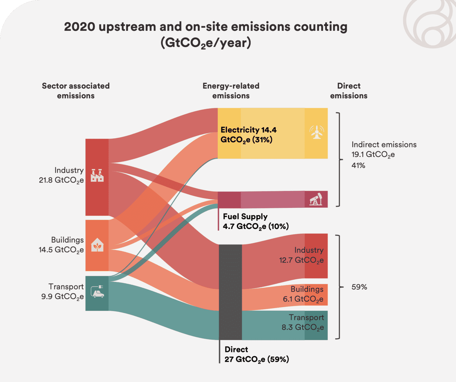
When visualized in a Sankey, the data helps us explain what we refer to as the “more pie for everyone” problem. In basic terms, there is a lot of double counting. Programmatic strategies are often based on sectors and claim to be addressing shares of the total emissions pie. However, if you added them together, you would get a result of more than 100% (see Figure 1 chart for example).
While this “double counting” is sometimes due to error, it more often means that the calculations include associated emissions that are counted elsewhere in order to strengthen their appeal as a priority area. A particular industry, for example, might only report its onsite or direct emissions. This ignores emissions from associated offsite electricity generation and further excludes associated emissions that result from the extraction, processing, and distribution of fuels used. Our data allow for narrow and expansive definitions of associated emissions and the inclusion of interactions with other sectors. In effect, this is taking into account supply, demand, and the interconnectivity between sectors. For philanthropy, this allows for a more nuanced understanding of the solution space by revealing system interactions.
Another useful representation of the data involves comparing outcomes from the Ensemble of scenarios at the heart of what we refer to as tradeoff analysis. We will publish a follow-up blog post on tradeoff analysis, which involves using constraints and incentives in the model to answer ”what-if” questions posed by partner organizations.
For now, we demonstrate this with the data using two of the scenarios from the Ensemble: the Central and Low-Transport Electrification (L-TEL) scenarios. The Central scenario is a High-Transport Electrification scenario that reaches 100% electrification of new sales for both freight and passenger vehicles by 2050. In this scenario, roughly 90% of vehicle fleets are electric, with the remaining 10% aging out of service thereafter. On the other hand, in the L-TEL scenario, roughly one-third of passenger vehicles are electrified and freight less than 10% by 2050.
In the aggregate, both pathways reach the same emissions result in 2050; however, transport emissions differ significantly. There is a cumulative 2.1 GtCO2e difference and in a highly constrained pathway, this can have a big impact elsewhere. The model compensates by finding commensurate amounts of reductions in other sectors. In Figure 2, we see this demonstrated through emissions outcomes in other end-use sectors: specifically, industry, followed by fuel supply. As emissions outcomes rise or fall in the transport sector, there is a tradeoff as other sectors respond and compensate.
Figure 2: 2050 net and gross sectoral emissions comparison
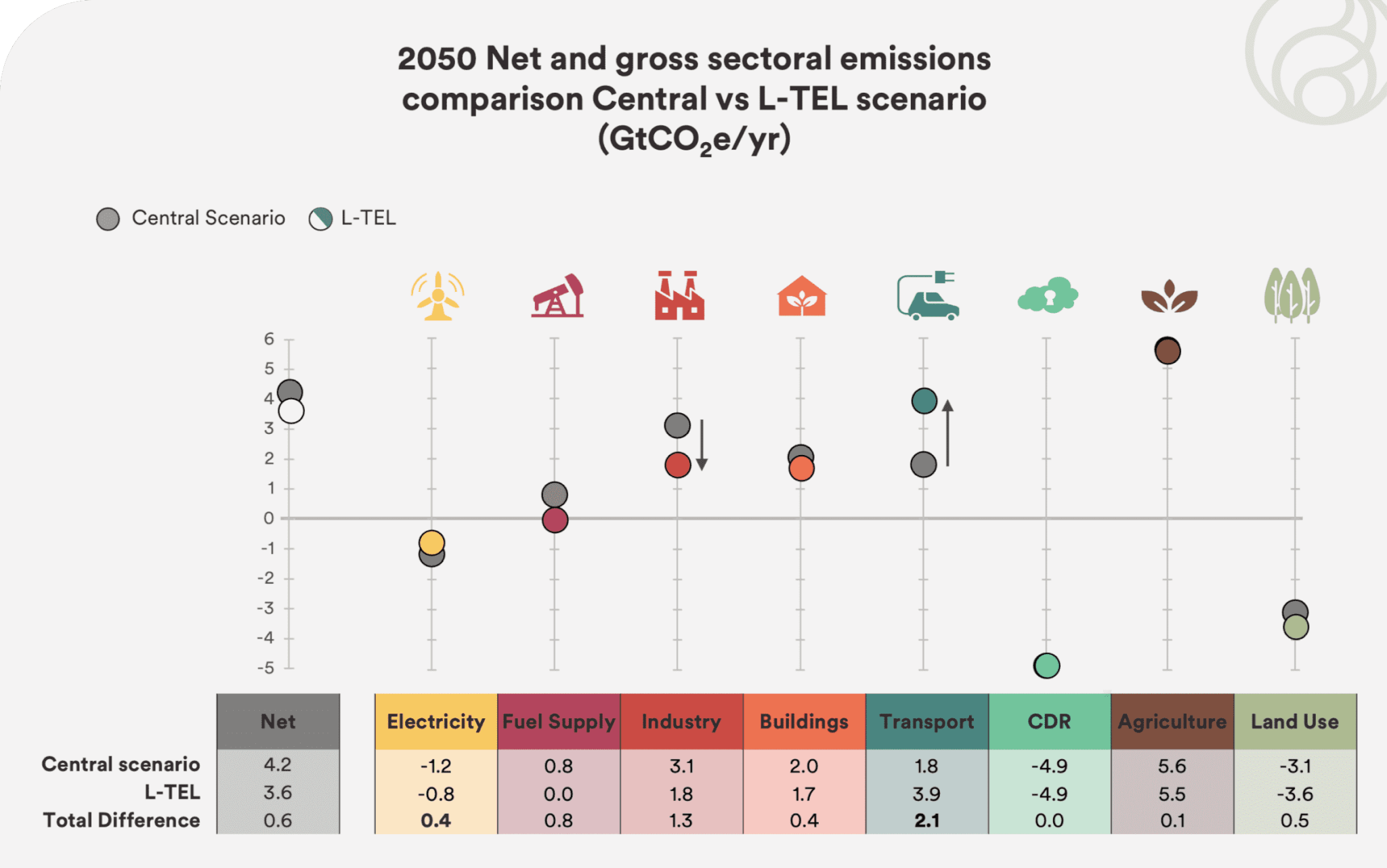
Comparing the Ensemble results reveals interconnections and tradeoffs between the uses of technologies. In aggregate, these comparisons lead to responses that may seem intuitive — for example, that increased ambition and use of a particular technology results in a decreased dependence elsewhere. Nonetheless, the details of where and how interconnected the responses are can still help funders determine where to place emphasis within their portfolios.
Future conversations on mitigation pathways
As mentioned, the data we released alongside our recent report is both an example of transparency and allows for more technical engagement on our pathways for those looking to do so. We understand, however, that not everyone is looking for this level of granularity when it comes to data. This is why we also directly engage with funders to better contextualize the mechanics of mitigation found in our pathways reporting. Understanding these mechanics is crucial for developing an effective climate strategy. We will further explore these approaches in upcoming entries to this ongoing blog series on mitigation pathways.
Read the full report, Achieving global climate goals by 2050: Pathways to a 1.5° C future.
Contact ClimateWorks to learn more about climate change mitigation opportunities, how to develop a climate strategy, or how we model our scenarios.


